An interesting look at the election map: Univ of Michigan style:
Maps of the 2016 US presidential election results
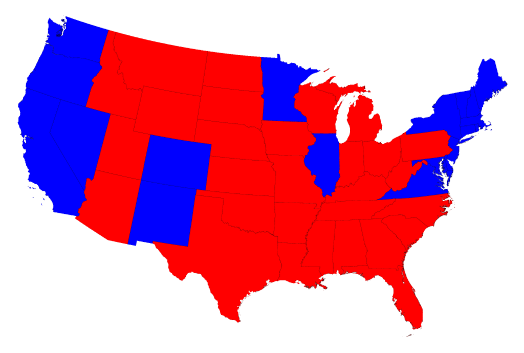
Election results by state
Most of us are, by now, familiar with the maps the TV channels and web sites use to show the results of presidential elections. Here is a typical map of the results of the 2016 election:
Click on any of the maps for a larger picture
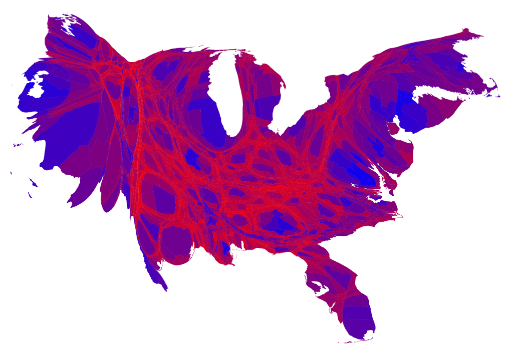
We can correct for this by making use of a cartogram, a map in which the sizes of states are rescaled according to their population. That is, states are drawn with size proportional not to their acreage but to the number of their inhabitants, states with more people appearing larger than states with fewer, regardless of their actual area on the ground. On such a map, for example, the state of Rhode Island, with its 1.1 million inhabitants, would appear about twice the size of Wyoming, which has half a million, even though Wyoming has 60 times the acreage of Rhode Island.
Here are the 2016 presidential election results on a population cartogram of this type:
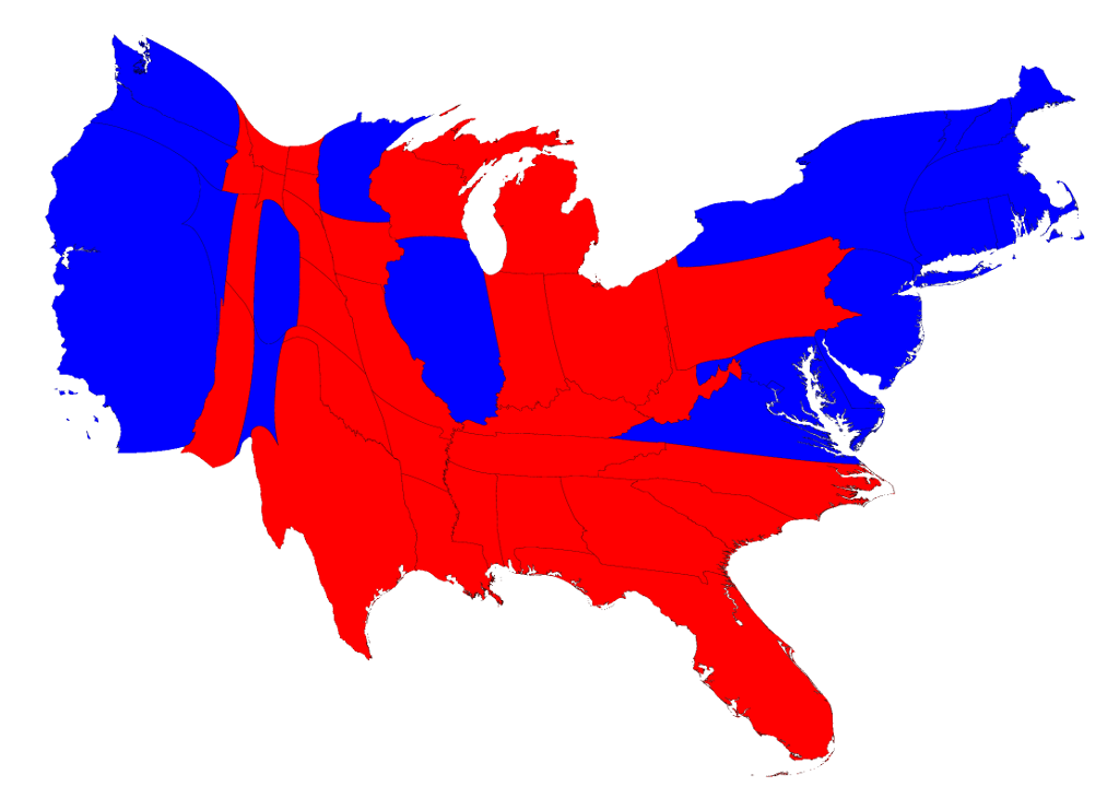
The presidential election, however, is not actually decided on the basis of the number of people who vote for each candidate but on the basis of the electoral college. Under the US electoral system, each state in the union contributes a certain number of electors to the electoral college, who vote according to the majority in their state. (Exceptions are the states of Maine and Nebraska, which use a different formula that allows them to split their electoral votes between candidates.) The candidate receiving a majority of the votes in the electoral college wins the election. The electors are apportioned among the states roughly according to population, as measured by the census, but with a small but deliberate bias in favor of less populous states.
We can represent the effects of the electoral college by scaling the sizes of states to be proportional to their number of electoral votes, which gives a map that looks like this:

The areas of red and blue on the cartogram are now proportional to the actual numbers of electoral votes won by each candidate. Thus this map shows at a glance both which states went to which candidate and which candidate won more electoral college votes. There is more red than blue in this case, indicating that Donald Trump won the election – something you cannot easily tell from the normal election-night red and blue map.
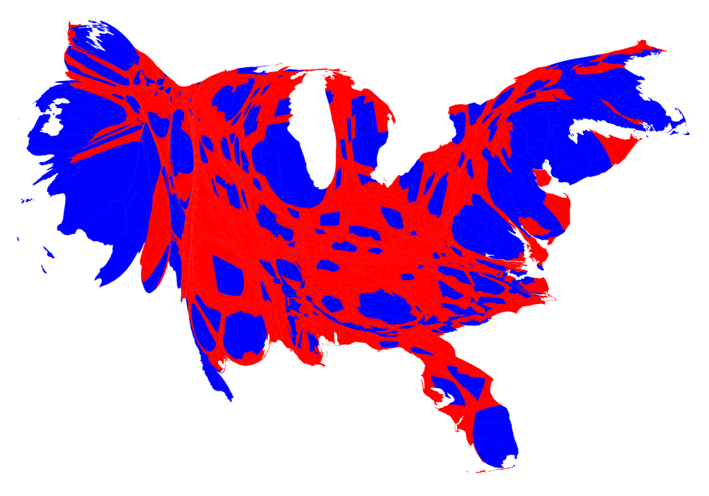
Election results by county
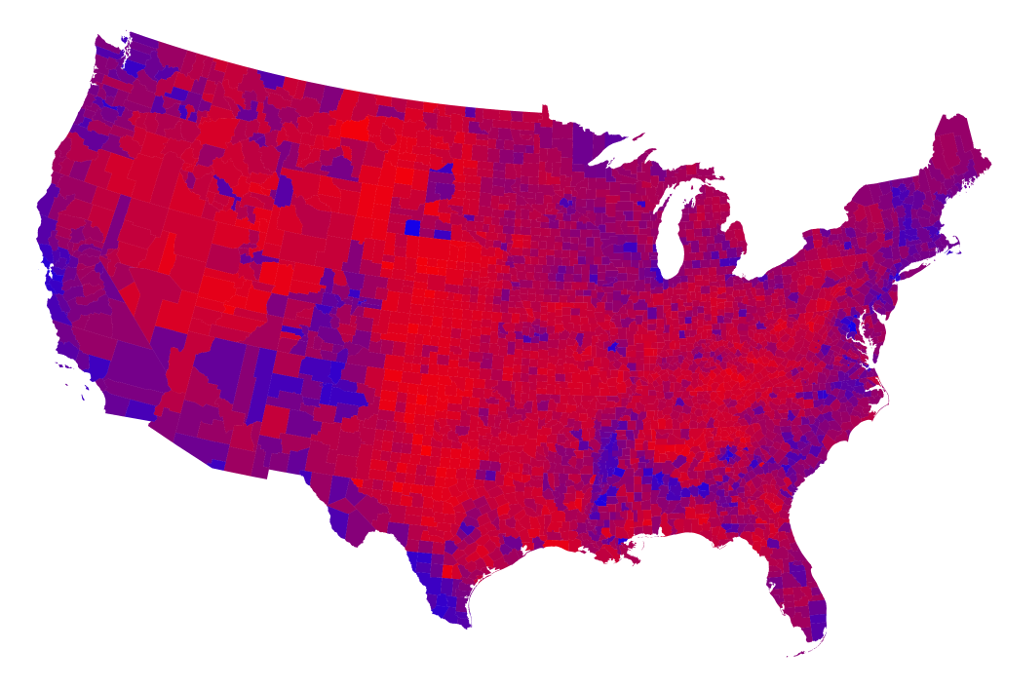
We can go further. We can do the same thing also with the county-level election results and the images are even more striking. Here is a map of US counties, again colored red and blue to indicate Republican and Democratic majorities respectively:

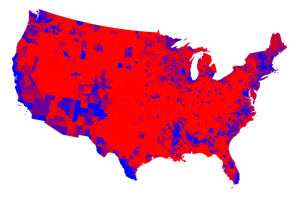
One way to reveal more nuance in the vote is to use not just two colors, red and blue, but to use red, blue, and shades of purple in between to indicate percentages of votes. Here is what the normal map looks like if you do this:
A slight variation on the same idea is to use a nonlinear color scale like this: